투명한 중공 또는 잘라낸 원
CSS 만 사용하여 속이 빈 원 을 잘라낼 수 있습니까?
이것은 우리 모두가 할 수있는 일입니다 :
그러나 우리는 이것을 할 수 있습니까?
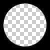
원은 중공과 투명해야한다 . 따라서 문제는 단색 원을 위에 놓아도 해결되지 않습니다 div.
두 가지 다른 기술을 사용 하여 투명한 컷 아웃 원 을 얻을 수 있습니다 .
1. SVG
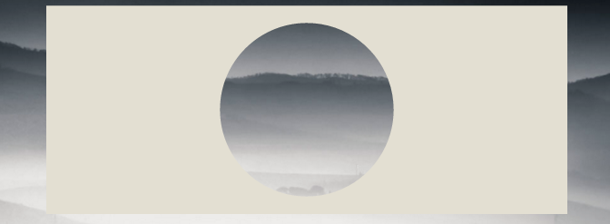
다음 예제에서는 인라인 svg를 사용합니다 . 첫 번째 조각은 마스크 요소 를 사용하여 투명한 원을 잘라 내고 두 번째 빈 원은 경로 요소 로 만들어집니다 . 원은 두 개의 호 명령으로 만들어집니다 .
마스크 요소 사용 :
body{background:url('https://farm9.staticflickr.com/8760/17195790401_ceeeafcddb_o.jpg');background-size:cover;}<svg viewbox="0 0 100 50" width="100%">
<defs>
<mask id="mask" x="0" y="0" width="80" height="30">
<rect x="5" y="5" width="90" height="40" fill="#fff"/>
<circle cx="50" cy="25" r="15" />
</mask>
</defs>
<rect x="0" y="0" width="100" height="50" mask="url(#mask)" fill-opacity="0.7"/>
</svg>하나의 경로 요소 사용 :
body{background: url('https://farm9.staticflickr.com/8760/17195790401_ceeeafcddb_o.jpg');background-size:cover;}
svg{
  display:block;
  width:70%;
  height:auto;
  margin:0 auto;
}
path{
  transition:fill .5s;
  fill:#E3DFD2;
}
path:hover{
  fill:pink;
}
<svg viewbox="-10 -1 30 12">
<path d="M-10 -1 H30 V12 H-10z M 5 5 m -5, 0 a 5,5 0 1,0 10,0 a 5,5 0 1,0 -10,0z"/>
</svg>이 경우 SVG 사용의 주요 이점은 다음과 같습니다.
- 짧은 코드
- 이미지 또는 그라디언트를 사용하여 원 마스크를 쉽게 채울 수 있습니다.
- 모양의 경계를 유지하고 마우스가 마스크와 관련된 채우기 위에 만 발생하도록 트리거 합니다 (예에서 투명하게 잘라낸 원 을 가리 킵니다 ).
2. BOX-SHADOWS 만 사용하는 CSS
overflow:hidden;border-radius를 사용하여 내부에 둥근 의사 요소가 있는 div를 만듭니다 . 거대한 상자 그림자와 배경을 지정하지 마십시오.
div{
    position:relative;
    width:500px; height:200px;
    margin:0 auto;
    overflow:hidden;
}
div:after{
    content:'';
    position:absolute;
    left:175px; top:25px;
    border-radius:100%;
    width:150px; height:150px;
    box-shadow: 0px 0px 0px 2000px #E3DFD2;
}

body{background: url('https://farm9.staticflickr.com/8760/17195790401_ceeeafcddb_o.jpg');background-size:cover;}<div></div>상자 그림자에 대한 브라우저 지원은 IE9 +입니다. canIuse 참조
동일한 접근 방식은 상자 그림자 대신 테두리를 사용하는 것입니다. IE8과 같은 box-shadows를 지원하지 않는 borowsers를 지원해야한다면 흥미 롭습니다. 기술은 동일하지만 div 중앙에 원을 유지하려면 상단 및 왼쪽 값으로 보정해야합니다.
body{
    background: url('https://farm9.staticflickr.com/8760/17195790401_ceeeafcddb_o.jpg');
    background-size:cover;
}
div{
    position:relative;
    width:500px; height:200px;
    margin:0 auto;
    overflow:hidden;
}
div:after{
    content:'';
    position:absolute;
    left:-325px; top:-475px;
    border-radius:100%;
    width:150px; height:150px;
    border:500px solid #E3DFD2;
}<div></div>방사형 그래디언트 배경과 포인터 이벤트를 사용하여 수행 할 수 있습니다 (예 : 텍스트 선택과 같이 원 레이어를 통해 마우스 상호 작용을 허용하기 위해). 다음 은 데모 페이지 와 스크린 샷입니다.
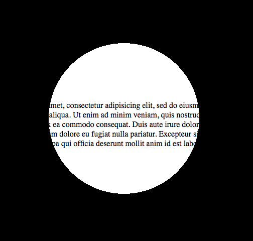
그리고 이것은 그것을위한 코드가 될 것입니다 :
<!DOCTYPE html>

<html>
<head>
<meta charset="UTF-8">
<style type="text/css" media="screen">
body {
  margin: 0;
  padding: 0;
}

.underneath {
  padding: 0;
  margin: 265px 0 0 0;
  width: 600px;
}

.overlay {
  top: 0;
  left: 0;
  position: absolute;
  width: 600px;
  height: 600px;
  background: -moz-radial-gradient(transparent 150px, rgba(0,0,0,1) 150px);
  background: -webkit-radial-gradient(transparent 150px, rgba(0,0,0,1) 150px);
  background: -ms-radial-gradient(transparent 150px, rgba(0,0,0,1) 150px);
  background: -o-radial-gradient(transparent 150px, rgba(0,0,0,1) 150px);
  pointer-events: none; /* send mouse events beneath this layer */
}
</style>
</head>
<body>

<p class="underneath">
  Lorem ipsum dolor sit amet, consectetur adipisicing elit, sed do eiusmod tempor
  incididunt ut labore et dolore magna aliqua. Ut enim ad minim veniam, quis
  nostrud exercitation ullamco laboris nisi ut aliquip ex ea commodo consequat.
  Duis aute irure dolor in reprehenderit in voluptate velit esse cillum dolore
  eu fugiat nulla pariatur. Excepteur sint occaecat cupidatat non proident, sunt
  in culpa qui officia deserunt mollit anim id est laborum.
</p>

<div class="overlay"></div>

</body>
</html>
web-tiki의 답변을 참조하면 div를 항상 중앙에 배치 할 수 translate(-50%,-50%)있으므로 border브라우저 지원이 더 나은 -property 를 사용하는 것이 문제가되지 않습니다 .
div{
    position:relative;
    width:500px;
    height:200px;
    margin:0 auto;
    overflow:hidden;
}
div:after{
    content:'';
    position:absolute;
    left:50%;
    top: 50%;
    transform: translate(-50%,-50%);
    border-radius:50%;
    width:150px; height:150px;
    border: 1000px solid rebeccapurple;
}

body{background: url('https://farm9.staticflickr.com/8760/17195790401_ceeeafcddb_o.jpg');background-size:cover;}<div></div>이 기술로 정말 창의력을 발휘할 수 있습니다
document.addEventListener( "DOMContentLoaded", function(){
	setInterval(function(){
		if(document.getElementById("moving").style.height === "500px"){
			document.getElementById("moving").style.height = "0px";
		} else {
			document.getElementById("moving").style.height = "500px";
		}
	}, 2000);
});
#container {
width: 500px;
margin: 0 auto;
border: 1px solid black;
overflow:hidden;
position: relative;
}
#circle{
position:relative;
height:150px;
margin:0 auto;
clear:left;
overflow:hidden;
}
#circle::before, #circle::after {
content:'';
border-radius:50%;
position: absolute;
left: 50%;
top: 50%;
transform: translate(-50%,-50%);
}
#circle::before {
height: 140px;
width: 140px;
background: rebeccapurple;
}
#circle::after{
width:150px;
height:150px;
border: 2000px solid rebeccapurple;
}
#line {
margin: 0 auto;
width: 6px;
height: 200px;
position: relative;
}
#line::before, #line::after {
content: " ";
background-color: rebeccapurple;
height: 200px;
width:2000px;
position:absolute;
}
#line::before {
right: 100%;
}
#line::after {
left: 100%;
}
#moving {
height: 0px;
width: 100%;
background: blue;
transition: 2s height;
position: absolute;
top: 0px;
z-index: -1;
}
body{
background: url('https://farm9.staticflickr.com/8760/17195790401_ceeeafcddb_o.jpg');background-size:cover;
}<div id="container">
<div id="circle"></div>
<div id="line"></div>
<div id="circle"></div>
<div id="moving"></div>
</div>"Pius Nyakoojo"의 "Method 1"에 대해서는 약간의 개선 (아래 참조)이 작동합니다. 개인적으로 이것이 가장 간단한 해결책이라고 생각합니다.

<html>
<!-- Assuming the stuff to mask is a 100 pixel square -->
<style>
.mask {
    position: absolute;
    top: -50px;                     /* minus half the div size */
    left: -50px;                    /* minus half the div size */
    width: 100px;                   /* the div size */
    height: 100px;                  /* the div size */
    background-color: transparent;
    border-radius: 100px;           /* the div size */
    border: 50px solid white;       /* half the div size */
    pointer-events: none;           /* send mouse events beneath this layer */
}

.stuff {
    position: absolute;
    width: 100px;                   /* the div size */
    height: 100px;                  /* the div size */
    overflow: hidden;               /* hide the excess of the mask border */
    background-color: #CCC;
}
</style>
<body>
    <div class="stuff">
        <div class="mask"></div>
        blah blah blah blah blah
        blah blah blah blah blah
        blah blah blah blah blah
    </div>
</body>
</html>
방법 1- 선호
<div class="circle"></div>
$radius: 50px;
$thickness: 5px;

.circle {
    width: $radius;
    height: $radius;
    background-color: transparent;
    border-radius: $radius;
    border: $thickness solid gray;
}
방법 2
<div class="circle"></div>
$radius: 50px;
$thickness: 5px;

.circle {
  width: $radius;
  height: $radius;
}

.circle::before, .circle::after {
  margin: -2px 0;
}
.circle::before {
    content: '';
    display: inline-block;
    width: $radius;
    height: calc(#{$radius} / 2);
    background-color: transparent;
    border-top-left-radius: calc(#{$radius} / 2);
    border-top-right-radius: calc(#{$radius} / 2);
    border: $thickness solid gray;
    border-bottom: 0;

    -webkit-box-sizing: border-box;
    -moz-box-sizing: border-box;
    box-sizing: border-box;
}

.circle::after {
  content: '';
  display: inline-block;
  width: $radius;
  height: calc(#{$radius} / 2);
  background-color: transparent;
  border-bottom-left-radius: calc(#{$radius} / 2);
  border-bottom-right-radius: calc(#{$radius} / 2);
  border: $thickness solid gray;
  border-top: 0;

  -webkit-box-sizing: border-box;
  -moz-box-sizing: border-box;
  box-sizing: border-box;
}
참조 URL : https://stackoverflow.com/questions/8286550/transparent-hollow-or-cut-out-circle
'programing' 카테고리의 다른 글
| Component에서 현재 경로 이름을 가져오려면 어떻게 해야 합니까? (0) | 2022.07.02 |
|---|---|
| Google Firestore에서 쿼리 커서를 처리하는 올바른 방법(Vue/Nuxt.js) (0) | 2022.07.02 |
| Double.valueof javadoc에서 캐시하지 않은 값을 캐시한다고 말하는 이유는 무엇입니까? (0) | 2021.01.19 |
| phantomjs“SyntaxError : Parse error”메시지에서 더 많은 정보 얻기 (0) | 2021.01.19 |
| Jackson으로 자식 ID 만 직렬화하는 방법 (0) | 2021.01.19 |